Colour Spaces, Profiles, Grading and Management
| Site: | Welcome to Emily Carr University's Moodle Site |
| Course: | Animation Resources |
| Book: | Colour Spaces, Profiles, Grading and Management |
| Printed by: | Guest user |
| Date: | Saturday, 18 May 2024, 10:16 PM |
Description
Technical information for how to consider and approach the use and need.
You can use the MENU at the RIGHT to go between pages in this How To Booklet.
Click the "<" at the top right if you do not see the menu.
Table of contents
- 1. What is Colour Correction and Grading?
- 2. ECUAD Colour Editing Software and Equipment
- 3. Colour Spaces & Management
- 4. Gamma: light-dark-contrast
- 5. Image Resolution
- 6. Choosing the Right Profiles
- 7. Set Photoshop's Colour Space
- 8. Set a Photoshop File's Colour Profile
- 9. Set Premiere's Display Colour Management
- 10. Monitor Display Colour Management in Premiere
- 11. Dynamic Media Technical Standards
- 12. DaVinci Resolve Intro Tutorial
1. What is Colour Correction and Grading?
The role of colour in animation is so enormous, and is established early on in the creative development of the project. Our use of processes and tools includes the very controllable digital softwares, like Photoshop, harmony and TV Paint. But animation
creation also includes various hand-based materials and methods, such as paper, clay, cut-outs, puppets and mixed medias.

Colour CORRECTION involves modifying colour and luma qualities to get it to have the proper set of colours.
Colour GRADING is a creative choice and about setting mood, energy and meaning through colour.
Both of these activities can affect colour hues, colour relationships, tint and saturation, brightness, contrast, and white and black values.
2D digital animation usually has less of a need for colour correction if it's been completely created and worked on in a software. But, the application of effects and compositing may influence this. Also, if original colour choices have been made without a colour correct professional monitor and high quality graphics card, you may in for some surprises when seeing your rendered movie through professional projectors and displays.
Stop-motion and camera-shot material has a need for correction because of the various real-world influences of lighting, exposures, and luma / colour balance in the camera settings. You might not even notice how a light's bulb can have a slight shift in its brightness and colour as it ages.
3D digital animation relies much more on colour correction because of all of the variables in simulated lighting, surface textures, effects and compositing.
What This Involves
Colour Scripts
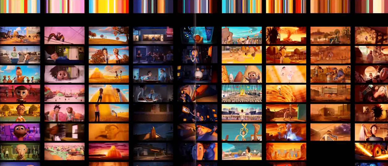
Colours have various mood connotations, and combining them can subconsciously make the viewer experience different emotions. The main goal is to craft and use colours to serve the story expression and experience in one way or another.
Color scripting is a process of mapping out the colour, lighting, and emotional connotations of an animated video in an animation or film. A colour script is a sequential and visual outline, explaining how colours will be used throughout the length
of the animation or film.
Colour Picking
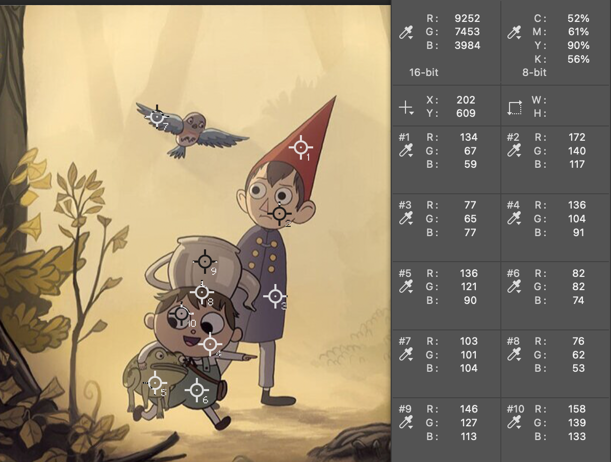
This is an early stage process of reviewing a colour palette or application of these colours using a proper colour correction environment. It's a good idea to do this before colours are applied to your entire animation. It will help to confirm or reveal surprises in your colour choices.
While digital screening devices can display a very wide range of colour, there are limits. Choosing highly saturated and out-of-range colours can leave you with surprises at how dull and unrelated some colours can look in your colour palette.
Our Animation Program has professional quality, colour correct calibrated display monitors on a computer that has a high-end BlackMagic graphics card. PLEASE USE THIS to review your initial colour selection plans and to make final colour choices.
Colour Correction
Colour correction is a process to fix colour problems and correct any deviations from the standard and planned colours in a project. It is widely used in animation, film, television, photography, print artwork, and more.
The main objective of this process is for colours to look clean and as close as possible to what they should be. In animation, "real" colour is relative to the project and its relationship to the "real world", but there is always a baseline for what the project puts forth as it's filmic world colours. Adjustments may be applied to the footage by adjusting the related qualities.
Some correction might happen in the project's production, before scenes are completed and rendered. Post-production colour correction takes place after shots are rendered, using appropriate software and viewing systems.
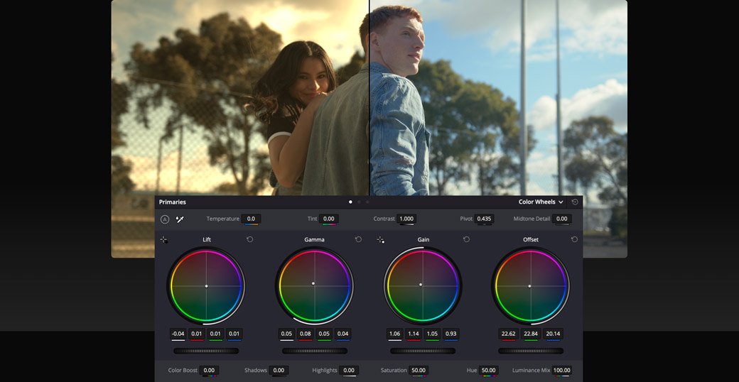
Colour Grading
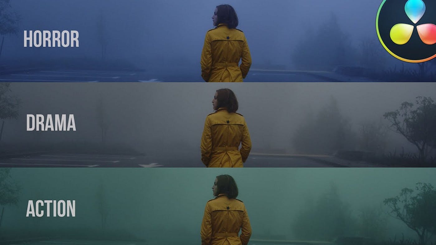
Colour grading choices come from a creative point of view. Color correction and colour grading are two different types of colour manipulation processes; however, their names are often used interchangeably. They look similar from
the technical point of view, but different in how and when they are used. After the rendered video is colour corrected, the aesthetics and thematic properties of the project can be improved through grading.
The aim colour grading is to improve the look of a project by adding new and/or other colours to the environment, or adjusting different attributes of an image such as saturation, colour, contrast, white balance, black level, noise level or sharpness; impacting the overall tone of the entire project to reach a certain look.
The right colour grading helps support the intentions of the colour script, for the purpose of conveying a certain visual mood to heighten the narrative experience.
Colour grading is an activity that takes place during post-production, using appropriate software and viewing systems.
2. ECUAD Colour Editing Software and Equipment
Our Emily Carr Animation program has editing station rooms with a PC workstation, professional Eizo ColourEdge colour-calibrated monitors, Blackmagic graphics cards, and "bias lighting" to reduce eye strain. These PC workstations have the Adobe Suite, Nuke, and DaVinci software. These elements are all selected for doing colour viewing, picking, and adjustment processes.
Edit Suite Information, ECU Animation Wiki
Our Animation Wiki contains all the necessary technical information.
Edit Suites 1,2, 3: Colour Correction and Editing
Edit Suites 4, 5: Video Editing, Sound recording (1 microphone) and editing
To check out an edit suite, go to Media Resources on the first floor, room D1310 and ask for an Animation Edit Suite key. Edit Suites 1, 2, and 3 are for colour critical work, Edit Suites 4 and 5 are for sound editing and recording. Suites can be reserved by requesting this at Media Resources.
3. Colour Spaces & Management
This information focus is on video media production goals and environments, as opposed to another medium like photography.
OUR GOAL is to be aware of, and select the proper colour spaces, profiles and bit-depth for the best quality image creation and viewing. This is a multi-step process that involves consideration of the image creation, editing and final viewing environments.
ESSENTIAL DEFINITIONS
Colour Management is the process of controlling the image quality of visual media as it is created, exported, and imported to various device destinations.
Colour Spaces are assigned and used for all image creation and editing environments and destination viewing devices (monitor displays, projectors, mobile devices). When you open any software, you have a "working colour space" that affects how you see your visuals. Your computer's display screen has a colour space profile associated with it (you can choose it). Additionally, a computer's OS system will apply interpretations with the goal of matching the various colour spaces.
Colour Profiles are the embedded information in your file, saying what colour, contrast, and luminance range it has available, and what colour space it uses to be displayed correctly. These profiles are read when you import your media into any image-viewing or editing environment. We always want to match the embedded profile to the working colour space.
Image resolution refers to qualities in the image file itself. It includes how many pixels per inch (PPI) in direct relationship to the file's height and width. The file's bit depth affects how many variations of colour, black, white and gray are available. Higher bit depth (16, 24, 32 bit-depth) means higher resolution. An image's perceived resolution will be affected by the destination viewing environment, such as a low quality screen versus a high quality one. More information can be found here.
Colour Channels are the Red, Green and Blue (RGB) channels embedded in any colour image. Each channel can be affected on its own, or as a group. A purely Grayscale image does not have RGB channels, and uses only one Grayscale channel. But you can have an image that looks grayscale but still is an RGB channel image.
Bit Depth refers to the amount of digital information available in each of the the colour channels of your image. (Audio also uses bit-depth as a measurement!) A higher bit-depth means that there are many more variations of colour and therefore values, shades, tones and contrast. We know of 8-bit imagery as the blocky cube-looking images, but 8-bit can be much more subtle. We want to work with 16-24 bit for a quality HD image.
Display monitors and screens have variable colour space profiles and the hardware's display qualities. Both of these affect the quality of what you see as you’re working.
File compression through the image format choices and export process affects media colour and depth resolution quality. First, we make sure that we have the best image quality that we need when we create the original work, so our options for output allow for the best quality.
The Beginner's Guide to Colour Management is a website instructional that goes in-depth on the array of topics that are involved.
________________________________________________________________________
OVERVIEW OF COLOUR SPACE AND PROFILE CHOICES
Photoshop's colour space selections
WORKING COLOUR SPACE PROFILE: A software that you use to create or edit images and video (like Photoshop) will use a working colour space profile for viewing your image properly. New files are automatically created with this same profile.
CHOOSING: This software's working colour space profile is something YOU select for a couple of important reasons.
ONE: to look the best on your display monitor, so the goal can be to match these profiles.
TWO: selecting a profile because it represents the final environment that will host your image or video (like YouTube, or an HD movie display, or a movie theatre screen).
See the chapter in this Moodle Booklet to see how to set up Photoshop's colour space and apply a colour profile.
BIT-DEPTH PROFILES: This is the image resolution "depth", aka image resolution quality, assigned for your editorial viewing and the export output. The most common bit-depth for your animation will be either 16-bit or 24-bit. The 32-bit is beyond what's needed and creates excessive file sizes. The image above is a simple demonstration of how increasing the amount of "bits" provides an increase in the resolution.
EXPORTING WITH COLOUR PROFILES: Unless you intentionally change it, your file export will use your working space's profile. Your media colour profile is chosen in direct relation to your destination viewing environment.
These qualities both define how the software and computer represent, create, and show the range and depth of available colours.
Photoshop, Premiere, After Effects and TB Harmony all have RGB colour space profiles that they use to process and show you the range of colours being used to create and edit the image. Photoshop has multiple working space profiles to select from.
(see the end of this page for info on how to set up Photoshop's colour space)
All phones and consumer level screens, and entry-level consumer cameras have a common profile, CIEsRGB.
Your computer's OS system also has control (Mac more than PC). It will interpret embedded colour profiles and adjust them to suit the OS and the various devices being used (screens, graphics cards). A professional graphics card like Blackmagic has a process to bypass this.
STANDARDS FOR COLOUR PROFILE MEASUREMENT

The
CIE, Internationale Commission on Illumination
, established guidelines defining how to measure colour and luminance values in electronic image display systems. Each device and system has it’s own CIE profile. These guidelines are used as reference to define different colour space profiles that
are used in different situations.
Colour profiles available in your software are designed to address the viewing DEVICE, the viewing and editing ENVIRONMENT, and the IMAGE VIEWING OUTPUT. These have been crafted by industry to measure against an international standard, and when you select a profile, it is also going to identify your brand of computer, phone or camera (graphics viewing device and display), and adjust accordingly.
COLOUR SPACE PROFILES
Here are some common colour space profiles to see how their range of colour is measured.
You can download this sample Quality Control PSD image to see the viewing results of changing the various colour space profiles inside of Photoshop.
Rec. 709 Gamma 2.4 colour space, theatrical viewing of video/film/animation

Rec. 709 is a colour space profile specific to HD VIDEO MEDIA and professional theatrical screening environments. This the colour space used in High Definition video mastering. It offers richer blacks and shadows than the other colour spaces listed in this page.
- Rec 709 has the same "footprint" as sRGB, but uses a different Gamma. This makes it easier to apply conversions if editing with sRGB imagery and needing to convert to Rec 709 for theatrical output.
- To function best for theatrical viewing, it is paired with Gamma 2.4. This is a less bright, less contrasty aspect than Gamma 2.2.
- This is currently the most common colour space profile for delivering HD home video content.
- This profile is specific to HD resolution of 1920 x 1080.
- It is sometimes referred to as BT. 709.
WHAT SHOULD I CHOOSE?
We choose the colour profile to work across our original image creation environment (cameras or software/computers), the editing environment and to match the viewing destination. The choice should accommodate the highest quality final viewing destination, because versions of the movie can then be exported to take on the profiles of lesser / other qualities.
Determine the final viewing environment (example: youtube vs movie theatre). Choose a colour space profile that matches this.
Use this same profile in any editing, compositing or colour correction software environment in your pipeline.
When exporting you can choose alternatives for varying viewing environments. BUT, when you change the colour space for a different destination, like going from Rec 709 to sRGB, you will see an image quality change.
Rec. 709 Gamma 2.4 is meant for HD Theatrical viewing environments, in the light controlled theatre viewing experience. It easily reflects the subtlety available in high bit-depth images: 16, 24 and 32-bit.
Rec. 709 Gamma 2.2 is meant for HD TV viewing environments, such as streaming your Netflix broadcast at home with the lights on or off. It also accommodates high bit-depth images: 16, 24 and 32-bit.
sRGB, also known as CIEsRGB, is meant for websites (mobile devices, laptops, computers) an gaming. It is a good platform for 8-bit quality, but can accommodate 16-bit. It uses Gamma 2.2, making it brighter and a bit more contrasty than Rec 709. Because every mobile device uses this profile, your colour should be relatively consistent across viewing situations.
See the CHAPTER on GAMMA, an essential quality that affects brightness and contrast.
sRGB colour space

It's best viewed in a Gamma 2.2 luminance space.
8-bit depth is adequate for this colour space.
Adobe RGB (1998) colour space

It relies on being seen in a Gamma 2.2 luminance space.
16-bit depth is preferred for supporting the full range of this colour space.
Compare the range of Adobe RGB 1998 to sRGB colour space

Notice the difference in the colour hue ranges, especially towards green.
Adobe Wide Gamut RGB

It relies on being seen in a Gamma 2.2 luminance space.
16-bit depth is needed for supporting the full range of this colour space.
4. Gamma: light-dark-contrast
WHAT'S GAMMA GOT TO DO WITH IT?
Gamma Correction, or just gamma, visually looks like the amount of brightness and contrast in a displayed image.
Gamma refers to what the incoming video signal says, and what the viewing device will create. Most display devices have a gamma of between 2.0 and 2.4.
Display monitors and their own colour profile includes a gamma setting.
Colour space profiles that we select in our software include a gamma setting.
Choosing Your Gamma
Gamma 1.8 - This used to be the standard setting for PC monitors, and you'll still see it in the lower quality and older monitors.
Gamma 2.0 - 2.2 – These lower gamma settings are generally used for brighter viewing conditions. Think: Office setting with bright overheads and lots of indirect daytime light from exterior windows.
- General computer screens
Gamma 2.4 – This gamma setting is generally used for darker viewing conditions. Think: Watching Prime Time television at night in a living room.
- Adobe Premiere Pro environment and export
- Rec 709
Gamma 2.6 - This gamma is used most commonly when preparing media for the fully "blacked out" viewing conditions of a movie theatre. A high gamma means a wider range of shadows will be darker. The darker viewing environment supports this level of image complexity.
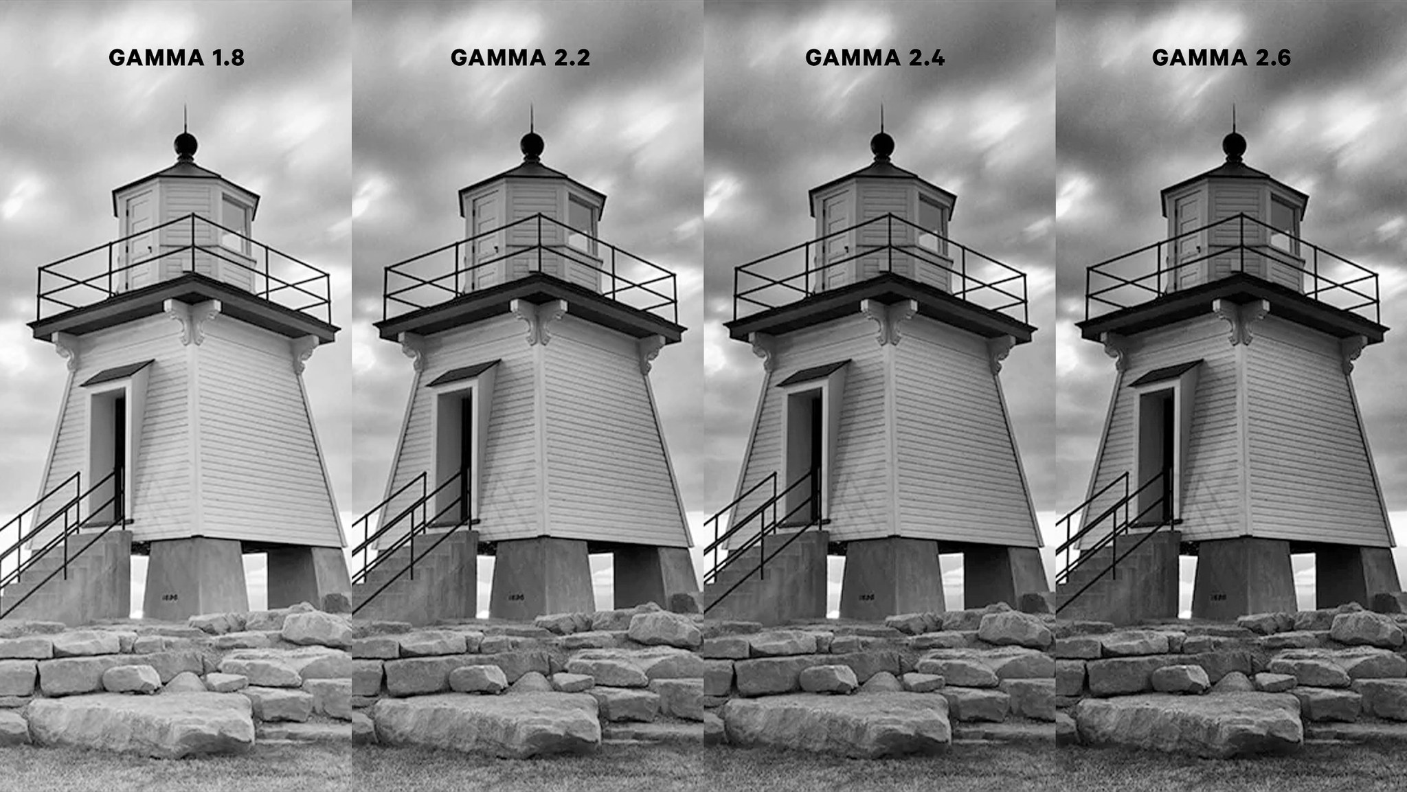
Here's an example of what these various gamma settings can look like side-by-side. (provided by display manufacturer Ben-Q)
As you can see, the higher the gamma numerical value, the darker and more contrast is in the image.
CONTEXT MATTERS
Gamma is also about what you see being affected by the context of what surrounds you and the image viewing device.
A simple demonstration is this graphic below. The grey rectangle at each end is exactly the same tone of grey. The dramatic difference of what surrounds it creates a very different perception of what tone the rectangle is.
Refer to the description above that identifies the viewing environments. This is the real "context" surrounding your displayed movie image.

image, Geoffrey Morrison/CNET
MAC OS and WASHED OUT GAMMA?
Macs have an ongoing issue called "Quicktime Gamma Shift". You will see what looks like a normal video in Premiere. But, when you export it to Quicktime, you get a slightly "washed out", brighter and lower contrast video image when viewing it in Quicktime on the Mac.
This is something written into Mac's ColorSync colour management system. There have been many attempts at workarounds, and there are some complex ones that claim success.
Almost all programs on the Mac are using ColorSync, so the only way to review your file without this issue is to take it to a PC. Do NOT start re-applying contrast levels and such to your file in order to make it look like what you see in Premiere.
If you'd like to learn more about this, you can watch this video or read this article.
5. Image Resolution
BIT-DEPTH: This is the image resolution quality assigned to your image's creation, editing, and export format. The final viewing environment has a secondary effect on the perceived bit depth quality.
The foundational quality of your image-making relies heavily on BIT-DEPTH. Likely selections for image bit depth falls into 8-bit or 16-bit. The proper selection influences how much image data is included in the image, and has an effect on any potential upcoming editing and compression choices.
HD quality media and still imagery should be 16-bit or 24-bit. These sizes contain the highest amount of image data, and can withstand more image processing without any substantial loss.
32-bit is beyond what's needed and creates excessive file sizes. Also, our eyes don't perceive the qualitative difference that results between 24 bit and 32 bit, and the barest amount between 16 and 32.
8 Bit Vs. 16 Bit
The most common choices animation artists are considering are between an 8 bit image and a 16 bit image. The best image quality to choose is 16-bit. Although there are higher bit-depth options, the human eye does not discern these differences, making the higher depth and file size a waste of resources.
If you're not already familiar with some basic image format terms (raster, vector, lossy, lossless, PNG, TIFF), this article does a good job of quickly reviewing them. These various formats have a great influence on image quality as well.
What is bit and bit depth?
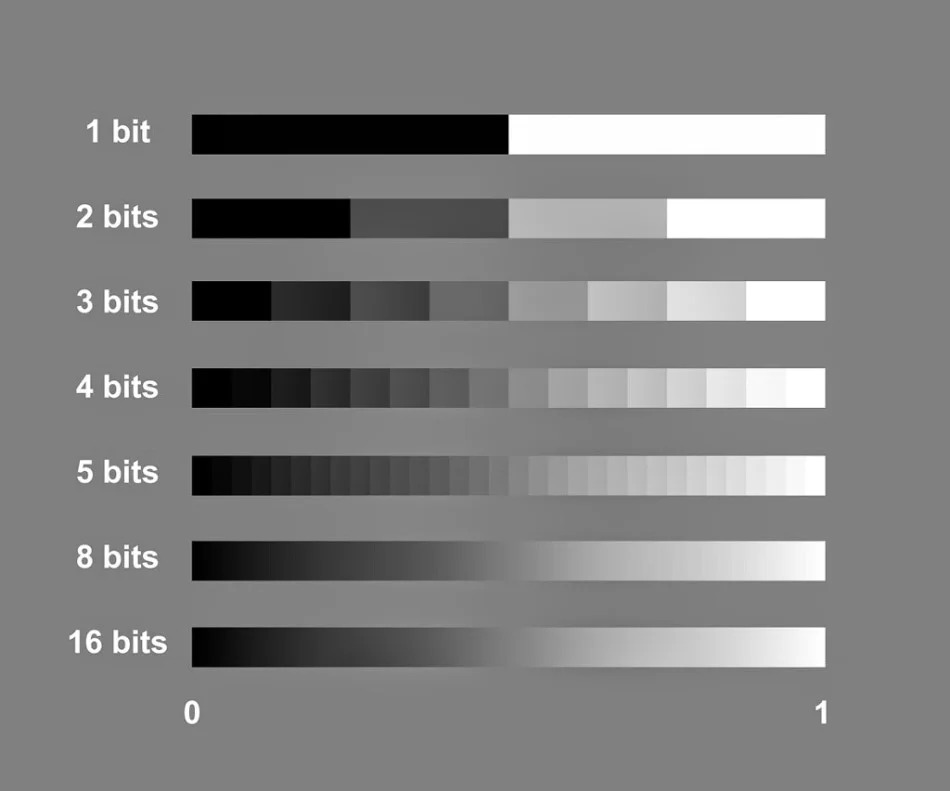
"Bit" is short for binary digit. Binary digits are the computer's language and will only ever be either 1 or 0. A binary number is made up of some combination of these digits; 1101, for instance. 1-bit offers only one digit, and so has two color possibilities: 1 and 0. 2-bit has four color possibilities: 01, 00, 10, and 11. 3-bit can create eight possibilities (8 different three digit numbers), and so on.
Bit depth refers to the number of memory bits used to store colour data for each pixel in a raster image (all pixels require the same number of bits in any given image). The number of bits determines the range of colours the image can have.
The amount of colour tones available are calculated by 2 to the exponent of the bit. For example, for an 8 bit image, you would figure out the tonal range by calculating 2 to the exponent of 8: 2 x 2 x 2 x 2 x 2 x 2 x 2 x 2 = 256. This means that there are 256 tonal values for each colour channel (Red Green Blue) in an 8 bit image. So 256 x 256 x 256 = roughly 16.8 million.
If you are calculating the tonal range for a 16 bit image, you would do 2 to the exponent of 16, which would exponentially increase the amount of tones available.
- 1 bit (21) = 2 tones (black and white, for example)
- 2 bits (22) = 4 tones (starts to add greys)
- 3 bits (23) = 8 tones
- 4 bits (24) = 16 tones
- 8 bits (28) = 256 tones
- 16 bits (216) = 65,536 tones (nice and smooth with all the variables!)
- 24 bits (224) = 16.7 million tones
-

- RGB stands for Red Green Blue, the digital array of primary digital (light) colours. Digital imagery files contain an individual CHANNEL for each of the R, G or B information. The viewable image is displayed with all channels visibly "on", and wesee a full colour picture. But we can and do edit the channels individually. COLOUR CORRECTION and GRADING activities rely on affecting the individual colour channels.
- RGB Channels contain BIT-DEPTH RESOLUTION.
Each RGB colour space is receiving the same measurement of bit-depth resolution assigned to the file. - For an 8-bit image, there are 256 tonal values possible. Using RGB channels, that means we have 256 possible colours for EACH colour channel.
- 256 x 256 x 256 = roughly 16.8 million colours! That seems like a lot, right?
- An image with 16 bits per channel will have up to 2^16 (to the power of) shades per channel, or 65536. If you have an RGB image where each of Red, Green, and Blue has 16 bits each:
65536 × 65536 × 65536 = 281 trillion colors!! That IS a lot.
Let's visualize the 8-bit concept. Here's a graphic suggesting colour in 3D space (the cube) and how the increase of visual colour data compares from 1-bit, 2-bit and 8-bit.
(from the Krita Manual)
Red Green Blue Channels

COMPARE VISUAL DATA FOR 8-BIT AND 16-BIT RGB
If we look at the HISTOGRAM of each RGB channel in both an 8-bit and a 16-bit image, you can see the dramatic difference in how much or how little visual data there is.
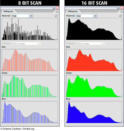
Image loss in posterization, aka banding
Image posterization, or "banding", is the unwanted result of lowering the bit-depth of an image, or starting with a lower bit depth than is necessary and then trying to manipulate its resolution or compression after the fact.
Distributing your media sometimes requires applying compression for a smaller file size. If you already have a low bit-depth, that compression is going to visibly break it down even further.


a smooth, un-posterized image vs. posterized image with banding
Instead of the smooth, natural-looking progression between colors or gradations, the color appears banded, with distinct lines or chunks of color instead of a visually pleasing flow. This image quality tester image was created and saved as 16-bit and then scaled back to 8-bit. These two histograms show the differences of the image data across the bit-depth options.
CRUSHING THE BIT-DEPTH INTO CRAP
Don't do this to your images! This demo image is from AnimatorIsland.com, and shows what happens to an 8-bit and 16-bit image if you compress their colour values (removing data) and then try to stretch them back to a full colour range. The 8-bit image has no latitude for this process and results in heavy visual banding because had a smaller amount of visual information to begin with. The 16-bit image survives the process and still looks good!

Histograms shows the bit-depth resolution data

The image used to create the histograms below, using 16-bit and 8-bit versions.


8-bit image histogram compared to a 16-bit image histogram. Notice the ragged data in the 8-bit image, and the much denser image data in the 16-bit image information.
File Quality Management
It's essential that you keep the image's quality consistently high all the way through the production and post-production pipeline. Always choose the highest quality resolution profile that you need to support the highest quality output.
- Image HEIGHT & WIDTH
- 1920 x 1080
- Image BIT-DEPTH
- 16-bit
- Sound BIT-DEPTH
- 24-bit
- Image Colour Profile
- Rec. 709: movie theatres, HD TV displays (home viewing)
- sRGB: mobile devices, general desktop viewing, YouTube, online
Here's a screenshot of where we can choose the bit-depth in After Effects.
Here's a tutorial video for an effective and fast overview of what you should know about image bit-depth and tonal range, 8 v 16. Although he addresses photography, it's applicable to any professional practice using digital imagery.
6. Choosing the Right Profiles
It's essential that you keep your visual image's quality consistently high all the way through the production and post-production pipeline. At every step of the way, always choose the highest quality resolution profile that you need to support the highest quality output.
This activity focus is called: File Quality Management
The file image quality that we (Emily Carr student projects) use is applicable in many professional environments. It's different than a professional feature film production or for broadcast commercials, but this is still able to be played in professional theatres and in broadcast.OUR IMAGE PROFILE TECHNICAL SPECIFICATIONS
- Image HEIGHT & WIDTH, Pixel Aspect Ratio
- 1920 x 1080, 1.0
- Image BIT-DEPTH
- 16-bit, 24-bit, 32-bit (Toon Boom uses 32-bit by default) (the bigger the bit depth, the larger the file size)
- Sound BIT-DEPTH, file format
- 24-bit, 48 kHz, WAV or AIF
- Image Colour Profile
- We choose the profile that is the best for the viewing destination and goal
- Rec. 709 Gamma 2.4: movie theatres, HD TV displays (home viewing), professional broadcast
- sRGB: classroom assignments and viewing, general desktop viewing, mobile devices, YouTube, online
- Working Colour Space
- Matching your image colour profile
- Rec 709 Gamma 2.4 for movie theatres, HD TV displays (home viewing), professional broadcast
- Rec. 709 Gamma 2.2: HD TV displays (home viewing)
- sRGB: classroom assignments and viewing, general desktop viewing, mobile devices, YouTube, online
- Viewing Colour Space
- Each image creation software has a viewing colour space that you can set. (Photoshop, Krita, Clip Studio Procreate)
- Photoshop's default is for viewing print colours, so always re-set it for digital media viewing. Not all software offers the options for setting this.
- Each image editing software (Premiere, After Effects) has it's own setting , which should change based on the project's working profile you choose.
- Each image creation software has a viewing colour space that you can set. (Photoshop, Krita, Clip Studio Procreate)
- Assets in the editing software
- You can re-set the profile associated with each asset (Premiere and Photoshop for example) to match your editing space, so you're not surprised when you export.
- You can re-set the profile associated with each asset (Premiere and Photoshop for example) to match your editing space, so you're not surprised when you export.
- Colour correct monitors and graphics card capabliities
- Consumer level: OS system reads and interprets or matches your image's profile to it. Usually sRGB colour (editing on your phone, your iPad)
- Pro-sumer level: OS has software and the hardware possibly has a good quality graphics card to allow user-selection of professional colour profiles; Rec709 and more. Editing on a Mac or PC workstation or high-end laptop.
- Professional, high end: display screens and graphics cards are the highest end and are professionally calibrated for broadcast quality colour viewing and editing.
MATCHING YOUR DISPLAY MONITOR'S PROFILE
The MAIN CONCEPT in selecting your software's "working colour space" is based on coordinating with your monitor's colour display profile. If you can bring these into partnership, your work looks it's best on the display monitor that you have.
Monitors will have a variety of colour profile options that are also based on the computer's OS.
To find and set your display monitor's colour profile
Mac: (Apple icon top left) > System Preferences > Displays > Color Profile
Your display monitor and a pull-down menu of options is here.
PC: Start > Color Management > Devices > your display monitor and a pull-down menu of options is here
SOFTWARE PROGRAM OPTIONS
Some media creation and editing software allow you to create or select the colour profiles, while some others make it rather difficult to do so. Here's an overview of some of our common programs:
ToonBoom Harmony allows you to affect your working space colour profiles for every individual layers (wow!) and to assign the colour space for the working file. Every single aspect of creating and compositing the image has its own colour space because compositing works with individual layers, which is what Harmony supports by doing this.
Here's how to assign your general working space profile in Harmony. Scene > Scene Settings > Colour Space tab
Premiere allows you to select the height + width in the Project Settings, and finds the bit-depth and colour profiles embedded in the imported clips. The colour space is pre-determined as a version of Rec. 709, but Premiere will make a viewing adjustment based on the display monitor's profile.
Premiere is much more fussy about changing the colour space away from Rec 709, and this Adobe Help doc explains how you can try to do this. Their advice is to NOT do it if your media and display monitor match. For example, your media colour profile is sRGB and your consumer level monitor is sRGB.
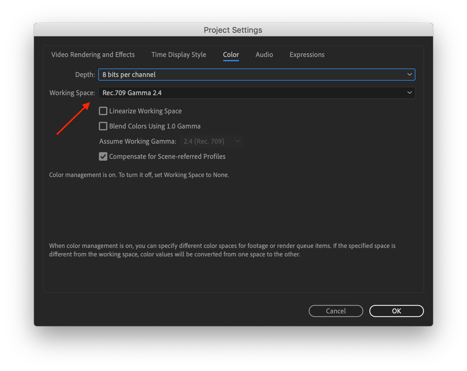
After Effects allows you to select the working colour space, bit depth, height and width in the Project Settings. Read about it here. There is a set of options, including Rec 709 (HDTV) and sRGB. Choose the option that best matches your display monitor.
File > Project Settings > Working Space...
When you import your footage, AFX applies colour profile management which prompts you to make a decision in "interpreting the footage" by selecting a colour profile or leaving "as is".
As in Premiere, After Effects colours are tweaked from their working colour space to the colour space of your computer monitor through the monitor profile. This conversion ensures that your composition will look identical on two different monitors if the monitors have been properly profiled. This conversion does not change the data within the composition's media.
You can choose whether or not to convert colours for your monitor using the View > Use Display Color Management menu command. (See Enable or disable display color management.) But, keep in mind that this conversion exists for a reason, which is to maintain visual consistency.
Photoshop allows you to easily establish the working colour space and the image colour profile. See the chapter in this Moodle booklet for that process. You can also read more about this online in Adobe Help.
7. Set Photoshop's Colour Space
Setting up your colour space profile for the working document and viewing situation. Photoshop is used as the example, and other programs will have their own set-up process.
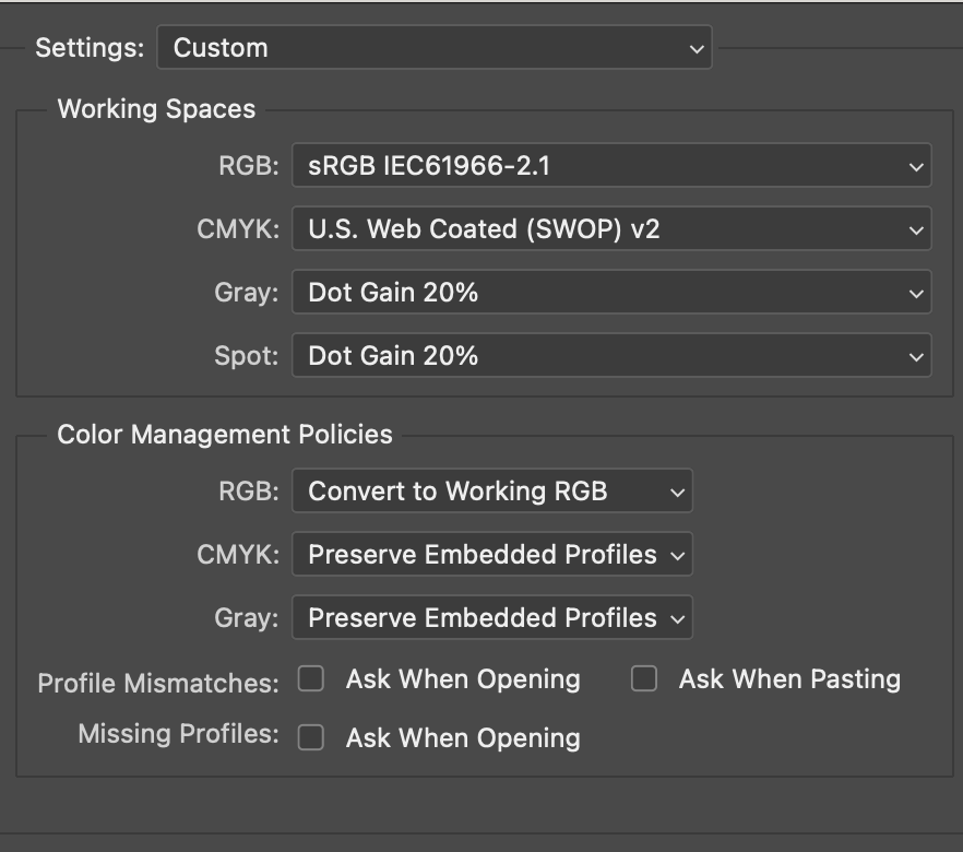
1. Set Photoshop's working space colour from inside your document
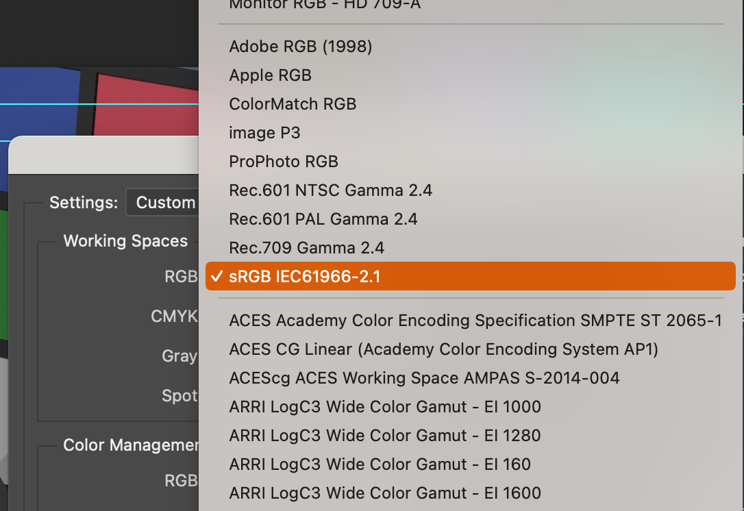
Edit > Colour Settings > Working Spaces > sRGB IEC
(same pop-up) Colour Management Policies > RGB > Convert to Working RGB
This second setting forces all imported imagery to adopt the working space profile.
"Preserve embedded profiles" allows each imported file to retain its own profile. This choice is more of a personalized one, but the forced conversion option aligns all material so there are no surprises later on.
2. Set the proper viewing environment in Photoshop, for all documents
View > Proof set-up > Internet standard RGB (sRGB)
View > Proof Colours > make sure this is OFF (no checkmark). It's a setting for CMYK print viewing.
View > Pixel Aspect Ratio > Square
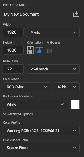
3. When creating a new Photoshop document
- File > New
- 1920 x 1080 (HD resolution and frame ratio)
- RGB Colour
- 16 bit
- Square pixels
4. Finding the Profile Info for a document
In PSD, you'll see a file's colour and bit profile in the document's label at the top: (RGB/16)
To check it in other ways:
Image > Mode > (RGB, 16 bit)
or, at the bottom left of the file, you'll see data text. Click on the > and select Document Profile.

5. EXPORTING to maintain image quality
Some programs allow you to import the entire PSD file as a Photoshop file, without saving it as something else. An example are the Adobe video editing environments of Premiere and After Effects.
Otherwise, choose a high quality image format of TIFF or PNG:
TIFF: allows layers (without effects information) and alpha channels
PNG: allows single layer with alpha channel
If you are exporting an image or image sequence:
- TIFF and PNG are close to equivalent, but many prefer PNG.
- A PNG export with alpha has to be output as 24-bit (extra bits to support the alpha).
8. Set a Photoshop File's Colour Profile
Once you set up Photoshop's Colour Settings and Colour Management Policies (see previous chapter in this book), any file that you open or paste into a new document will have it's embedded profile reviewed automatically. If it doesn't match the Working Space profile, you'll be prompted to see if you want it converted.
For consistency, have all colour profiles be consistent and matching the working environment.
Premiere and After Effects are very different. They automatically assign the colour space unless you force them to adjust it, and this requires at least 1GB VRAM on your computer.
Imported documents:
- Convert: If you told Photoshop to automatically convert imported profiles, it will change any profile that does not match your workings space profile to match it.
- Preserve: If you told Photoshop to Preserve embedded profiles, a non-matching profile will get a warning from Photoshop that says it does not match the working space, and ask if you want to convert it.
New documents: If you are creating a new document, it will automatically create it using the colour Working Space you assigned in your Colour Settings.
Assign a Profile: You can give a document a colour profile when you have it opened.
- Edit > Assign Profile
- The Working profile is the option selected by default. You can change this if you want.
- Edit > Convert to Profile.
- Destination Space > Profile > (default is your working space profile, you can choose others)
9. Set Premiere's Display Colour Management
Adobe Premiere display management can be adjusted to enhance the viewing results if your timeline media is comprised of sRGB colour profile material, but your professional display monitor is Rec. 709.
This process requires a robust 1GB of VRAM in your computer. To determine if you have this available, follow the initial steps of the Adobe online written instructions (link below).
Do NOT use Display Color Management if: If your media is sRGB and the destination for your video is an online video channel such as YouTube, Facebook, Vimeo, or played back on an sRGB display.
CAN use if: If your media is sRGB and the destination for your video is a broadcaster (Rec. 709) quality monitor and system.
Our Colour Correction Edit Suites have professional monitors and software that are designed to display sRGB and Rec. 709.
This Adobe Help doc provides written step-by-step instruction.
This video tutorial walks you through it.
10. Monitor Display Colour Management in Premiere
Ever think “this footage looked different on my other computer”? This information is about addressing display monitors and how they show your colour when viewing your media in Premiere.
From Adobe
When you move your files from monitor to monitor, the colours will shift. This shift occurs because every device has a different colour gamut and thus reproduces the colours differently.
Colour management translates the media colours so that each device can reproduce them in the same way. The colours that you see on your monitor are close to the colours in your printed image. All colours may not match exactly because the printer may not reproduce the same range of colours as the monitor.
This process is best described in Adobe's own documents and the helpful video tutorial.
Adobe Help Doc: Colour Management in Premiere
Display Colour Management in Adobe Premiere Pro
11. Dynamic Media Technical Standards
Our Project Settings
Our program has established a standard profile for all media exports in relationship to grad screenings. These standards are relevant to the professional world, and are available in your editing software.
Dynamic Media Technical Standards, Emily Carr DM Grad Hub
What goes in affects what comes out
The quality of your final export relies on the source media clips being of the highest quality. Use the same technical standards outlined in the Hub link to output each of your media clips.
This will create a large editing file environment! If needed, you can use PROXY EDITING until you're ready to export.
Do you know how to properly set up Premiere's settings?
10 Things Beginners Want to Know How to Do (youtube tutorial)
How to Set Up Premiere 2020 Project Preferences and Settings (youtube 13 minute tutorial)
How to Set Up Premiere 2020 Sequence Settings (youtube, 1080 format portion takes 3 min)
12. DaVinci Resolve Intro Tutorial
DaVinci Resolve is one way you can take advantage of our Editing Suites' full power. Adobe Premiere and After Effects also support colour correction, and these will work really well. But, Adobe is currently conflicting with the Blackmagic card.
Use Adobe Photoshop, Premiere or After Effects and professional colour correction monitor display to colour correct and grade. This method uses the PC OS system's graphics card to show your media in the professional colour correction monitor display. This is much, much better quality and reliability than your laptop or desktop.
Use DaVinci Resolve and the Blackmagic graphics card to view your media on the professional colour correction monitor display to colour correct and grade. The Blackmagic card is pro-level colour correction equipment, and is tied directly to DaVinci Resolve. There's an emphasis on using it to perform the larger and in-depth efforts to affect the image quality of your media.
Refer to this Moodle document's chapter "ECUAD Colour Editing Software and Equipment" to learn how to access and set-up proper use of your media, and use either the Colour Correct monitor and Adobe, and/or the DaVinci Resolve / Blackmagic environment.
Color Correction for Complete Beginners (DaVinci Resolve 17 Tutorial)
DaVinci Resolve 18, training videos from the manufacturer
DaVinci Resolve 17 Tutorial for Beginners 2021