Colour Spaces, Profiles, Grading and Management
Technical information for how to consider and approach the use and need.
You can use the MENU at the RIGHT to go between pages in this How To Booklet.
Click the "<" at the top right if you do not see the menu.
3. Colour Spaces & Management
This information focus is on video media production goals and environments, as opposed to another medium like photography.
OUR GOAL is to be aware of, and select the proper colour spaces, profiles and bit-depth for the best quality image creation and viewing. This is a multi-step process that involves consideration of the image creation, editing and final viewing environments.
ESSENTIAL DEFINITIONS
Colour Management is the process of controlling the image quality of visual media as it is created, exported, and imported to various device destinations.
Colour Spaces are assigned and used for all image creation and editing environments and destination viewing devices (monitor displays, projectors, mobile devices). When you open any software, you have a "working colour space" that affects how you see your visuals. Your computer's display screen has a colour space profile associated with it (you can choose it). Additionally, a computer's OS system will apply interpretations with the goal of matching the various colour spaces.
Colour Profiles are the embedded information in your file, saying what colour, contrast, and luminance range it has available, and what colour space it uses to be displayed correctly. These profiles are read when you import your media into any image-viewing or editing environment. We always want to match the embedded profile to the working colour space.
Image resolution refers to qualities in the image file itself. It includes how many pixels per inch (PPI) in direct relationship to the file's height and width. The file's bit depth affects how many variations of colour, black, white and gray are available. Higher bit depth (16, 24, 32 bit-depth) means higher resolution. An image's perceived resolution will be affected by the destination viewing environment, such as a low quality screen versus a high quality one. More information can be found here.
Colour Channels are the Red, Green and Blue (RGB) channels embedded in any colour image. Each channel can be affected on its own, or as a group. A purely Grayscale image does not have RGB channels, and uses only one Grayscale channel. But you can have an image that looks grayscale but still is an RGB channel image.
Bit Depth refers to the amount of digital information available in each of the the colour channels of your image. (Audio also uses bit-depth as a measurement!) A higher bit-depth means that there are many more variations of colour and therefore values, shades, tones and contrast. We know of 8-bit imagery as the blocky cube-looking images, but 8-bit can be much more subtle. We want to work with 16-24 bit for a quality HD image.
Display monitors and screens have variable colour space profiles and the hardware's display qualities. Both of these affect the quality of what you see as you’re working.
File compression through the image format choices and export process affects media colour and depth resolution quality. First, we make sure that we have the best image quality that we need when we create the original work, so our options for output allow for the best quality.
The Beginner's Guide to Colour Management is a website instructional that goes in-depth on the array of topics that are involved.
________________________________________________________________________
OVERVIEW OF COLOUR SPACE AND PROFILE CHOICES
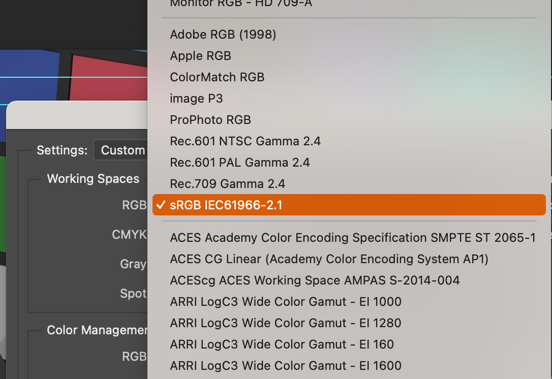
Photoshop's colour space selections
WORKING COLOUR SPACE PROFILE: A software that you use to create or edit images and video (like Photoshop) will use a working colour space profile for viewing your image properly. New files are automatically created with this same profile.
CHOOSING: This software's working colour space profile is something YOU select for a couple of important reasons.
ONE: to look the best on your display monitor, so the goal can be to match these profiles.
TWO: selecting a profile because it represents the final environment that will host your image or video (like YouTube, or an HD movie display, or a movie theatre screen).
See the chapter in this Moodle Booklet to see how to set up Photoshop's colour space and apply a colour profile.
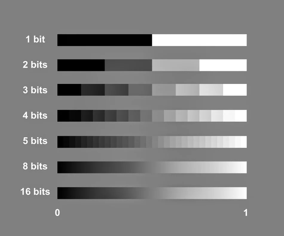
BIT-DEPTH PROFILES: This is the image resolution "depth", aka image resolution quality, assigned for your editorial viewing and the export output. The most common bit-depth for your animation will be either 16-bit or 24-bit. The 32-bit is beyond what's needed and creates excessive file sizes. The image above is a simple demonstration of how increasing the amount of "bits" provides an increase in the resolution.
EXPORTING WITH COLOUR PROFILES: Unless you intentionally change it, your file export will use your working space's profile. Your media colour profile is chosen in direct relation to your destination viewing environment.
These qualities both define how the software and computer represent, create, and show the range and depth of available colours.
Photoshop, Premiere, After Effects and TB Harmony all have RGB colour space profiles that they use to process and show you the range of colours being used to create and edit the image. Photoshop has multiple working space profiles to select from.
(see the end of this page for info on how to set up Photoshop's colour space)
All phones and consumer level screens, and entry-level consumer cameras have a common profile, CIEsRGB.
Your computer's OS system also has control (Mac more than PC). It will interpret embedded colour profiles and adjust them to suit the OS and the various devices being used (screens, graphics cards). A professional graphics card like Blackmagic has a process to bypass this.
STANDARDS FOR COLOUR PROFILE MEASUREMENT

The
CIE, Internationale Commission on Illumination
, established guidelines defining how to measure colour and luminance values in electronic image display systems. Each device and system has it’s own CIE profile. These guidelines are used as reference to define different colour space profiles that
are used in different situations.
Colour profiles available in your software are designed to address the viewing DEVICE, the viewing and editing ENVIRONMENT, and the IMAGE VIEWING OUTPUT. These have been crafted by industry to measure against an international standard, and when you select a profile, it is also going to identify your brand of computer, phone or camera (graphics viewing device and display), and adjust accordingly.
COLOUR SPACE PROFILES
Here are some common colour space profiles to see how their range of colour is measured.
You can download this sample Quality Control PSD image to see the viewing results of changing the various colour space profiles inside of Photoshop.
Rec. 709 Gamma 2.4 colour space, theatrical viewing of video/film/animation

Rec. 709 is a colour space profile specific to HD VIDEO MEDIA and professional theatrical screening environments. This the colour space used in High Definition video mastering. It offers richer blacks and shadows than the other colour spaces listed in this page.
- Rec 709 has the same "footprint" as sRGB, but uses a different Gamma. This makes it easier to apply conversions if editing with sRGB imagery and needing to convert to Rec 709 for theatrical output.
- To function best for theatrical viewing, it is paired with Gamma 2.4. This is a less bright, less contrasty aspect than Gamma 2.2.
- This is currently the most common colour space profile for delivering HD home video content.
- This profile is specific to HD resolution of 1920 x 1080.
- It is sometimes referred to as BT. 709.
WHAT SHOULD I CHOOSE?
We choose the colour profile to work across our original image creation environment (cameras or software/computers), the editing environment and to match the viewing destination. The choice should accommodate the highest quality final viewing destination, because versions of the movie can then be exported to take on the profiles of lesser / other qualities.
Determine the final viewing environment (example: youtube vs movie theatre). Choose a colour space profile that matches this.
Use this same profile in any editing, compositing or colour correction software environment in your pipeline.
When exporting you can choose alternatives for varying viewing environments. BUT, when you change the colour space for a different destination, like going from Rec 709 to sRGB, you will see an image quality change.
Rec. 709 Gamma 2.4 is meant for HD Theatrical viewing environments, in the light controlled theatre viewing experience. It easily reflects the subtlety available in high bit-depth images: 16, 24 and 32-bit.
Rec. 709 Gamma 2.2 is meant for HD TV viewing environments, such as streaming your Netflix broadcast at home with the lights on or off. It also accommodates high bit-depth images: 16, 24 and 32-bit.
sRGB, also known as CIEsRGB, is meant for websites (mobile devices, laptops, computers) an gaming. It is a good platform for 8-bit quality, but can accommodate 16-bit. It uses Gamma 2.2, making it brighter and a bit more contrasty than Rec 709. Because every mobile device uses this profile, your colour should be relatively consistent across viewing situations.
See the CHAPTER on GAMMA, an essential quality that affects brightness and contrast.
sRGB colour space

It's best viewed in a Gamma 2.2 luminance space.
8-bit depth is adequate for this colour space.
Adobe RGB (1998) colour space

It relies on being seen in a Gamma 2.2 luminance space.
16-bit depth is preferred for supporting the full range of this colour space.
Compare the range of Adobe RGB 1998 to sRGB colour space

Notice the difference in the colour hue ranges, especially towards green.
Adobe Wide Gamut RGB

It relies on being seen in a Gamma 2.2 luminance space.
16-bit depth is needed for supporting the full range of this colour space.