Colour Spaces, Profiles, Grading and Management
Technical information for how to consider and approach the use and need.
You can use the MENU at the RIGHT to go between pages in this How To Booklet.
Click the "<" at the top right if you do not see the menu.
4. Gamma: light-dark-contrast
WHAT'S GAMMA GOT TO DO WITH IT?
Gamma Correction, or just gamma, visually looks like the amount of brightness and contrast in a displayed image.
Gamma refers to what the incoming video signal says, and what the viewing device will create. Most display devices have a gamma of between 2.0 and 2.4.
Display monitors and their own colour profile includes a gamma setting.
Colour space profiles that we select in our software include a gamma setting.
Choosing Your Gamma
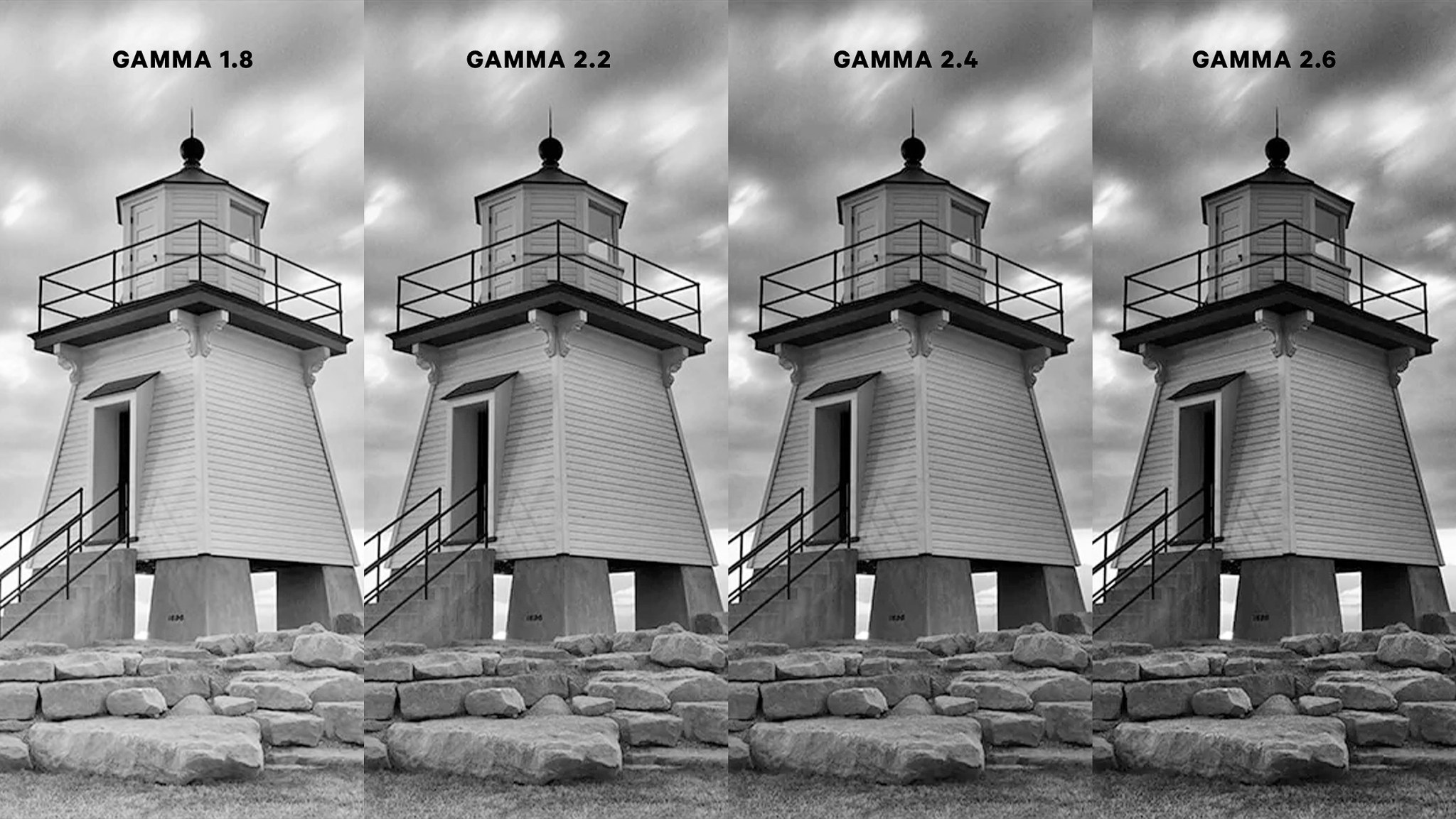
Gamma 1.8 - This used to be the standard setting for PC monitors, and you'll still see it in the lower quality and older monitors.
Gamma 2.0 - 2.2 – These lower gamma settings are generally used for brighter viewing conditions. Think: Office setting with bright overheads and lots of indirect daytime light from exterior windows.
- General computer screens
Gamma 2.4 – This gamma setting is generally used for darker viewing conditions. Think: Watching Prime Time television at night in a living room.
- Adobe Premiere Pro environment and export
- Rec 709
Gamma 2.6 - This gamma is used most commonly when preparing media for the fully "blacked out" viewing conditions of a movie theatre. A high gamma means a wider range of shadows will be darker. The darker viewing environment supports this level of image complexity.
Here's an example of what these various gamma settings can look like side-by-side. (provided by display manufacturer Ben-Q)
As you can see, the higher the gamma numerical value, the darker and more contrast is in the image.
CONTEXT MATTERS
Gamma is also about what you see being affected by the context of what surrounds you and the image viewing device.
A simple demonstration is this graphic below. The grey rectangle at each end is exactly the same tone of grey. The dramatic difference of what surrounds it creates a very different perception of what tone the rectangle is.
Refer to the description above that identifies the viewing environments. This is the real "context" surrounding your displayed movie image.

image, Geoffrey Morrison/CNET
MAC OS and WASHED OUT GAMMA?
Macs have an ongoing issue called "Quicktime Gamma Shift". You will see what looks like a normal video in Premiere. But, when you export it to Quicktime, you get a slightly "washed out", brighter and lower contrast video image when viewing it in Quicktime on the Mac.
This is something written into Mac's ColorSync colour management system. There have been many attempts at workarounds, and there are some complex ones that claim success.
Almost all programs on the Mac are using ColorSync, so the only way to review your file without this issue is to take it to a PC. Do NOT start re-applying contrast levels and such to your file in order to make it look like what you see in Premiere.
If you'd like to learn more about this, you can watch this video or read this article.